Our logo
What does the logo mean?
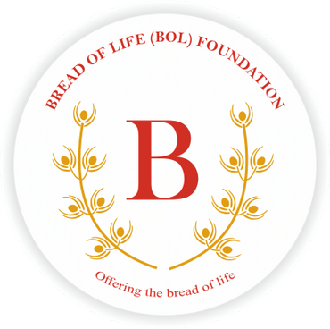
Our logo is more than a name or symbol — it’s one of the most recognizable elements of our identity. It reflects the mission and vision of the Bread of Life (B.O.L.) Foundation, uniting our commitment to compassion, dignity, and service for those in need.
The motto Bread of Life (B.O.L.) serves as an invitation to recognize and respond to the needs of others, ensuring that no individual is left without care, support, or opportunity. It conveys the belief that “the pain of one, even the smallest member, is the pain of all,” and that service to others is both a personal responsibility and a shared societal duty.
The logo, designed by Gaurav Patole, Founder & Director of BOL Foundation, captures the interconnected theme of sustenance and the 14 works of mercy. At its center is the letter ‘B’, symbolizing bread — a universal sign of nourishment and life. The letter ‘B’ is shaded in a deep scarlet tone, representing dedication, compassion, and sacrifice. Surrounding it are golden wheat grains, symbolizing the fruits of nature and human effort. The raised hands beneath the grains depict the spirit of giving, sharing, and community support.
Each golden grain leaf represents an act of mercy. There are seven leaves on each of the two stems, making a total of fourteen — signifying the 14 works of mercy, divided into two categories:
Corporal Works of Mercy (addressing physical needs):
- Feed the hungry
- Give drink to the thirsty
- Shelter the homeless
- Visit the sick
- Visit the imprisoned
- Bury the dead
- Give alms to the poor
Spiritual Works of Mercy (addressing emotional, mental, and moral needs):
- Counsel those in doubt
- Instruct those who seek knowledge
- Admonish harmful actions
- Comfort the sorrowful
- Forgive offences
- Bear difficulties patiently
- Pray or reflect for the well-being of all
The two stems in the logo are mirror images of each other, symbolizing the balance between meeting physical and emotional needs, and showing how both are equally vital for human dignity. The design emphasizes that the works of mercy are not isolated acts, but part of an interconnected approach to building a caring, inclusive, and compassionate society.
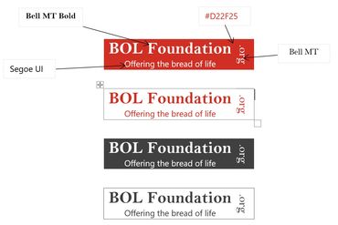
The organization’s name — “BREAD OF LIFE (BOL) FOUNDATION” — along with the motto “Offering the Bread of Life”, appears in scarlet red against a white background, symbolizing hope, humanity, and service that transcends barriers.

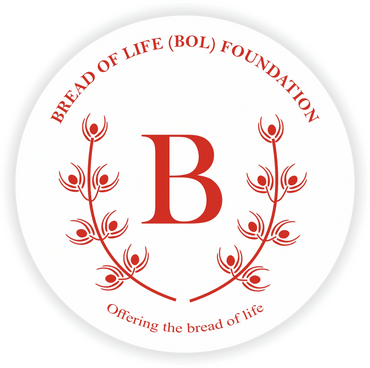
Bread of Life (BOL) Foundation Original Logo v2
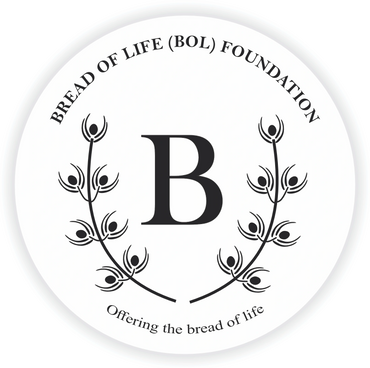
logo Gallery